
Slip Decoration Plates
After using slip to decorate my Human Figures, I really enjoyed the medium and how you could layer colours on top of one another to get precise results.
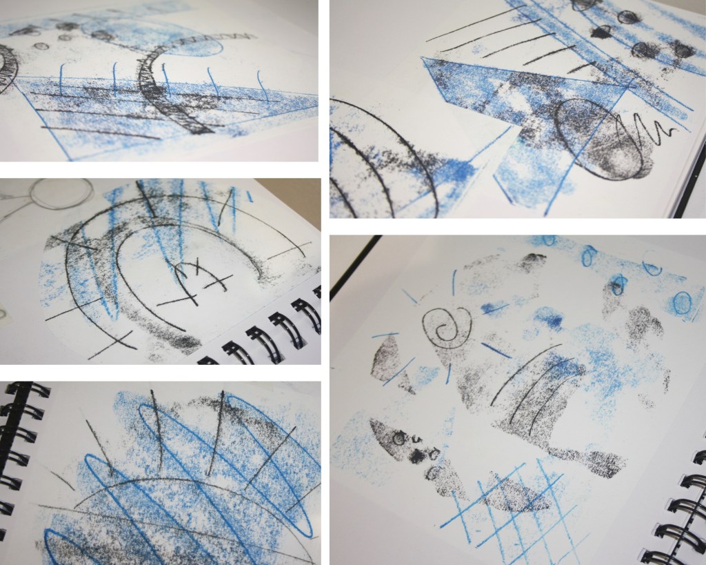
I started out by using some lino prints I had done at a workshop at the Cornwall College as inspiration for the abstract designs I would try to emulate.
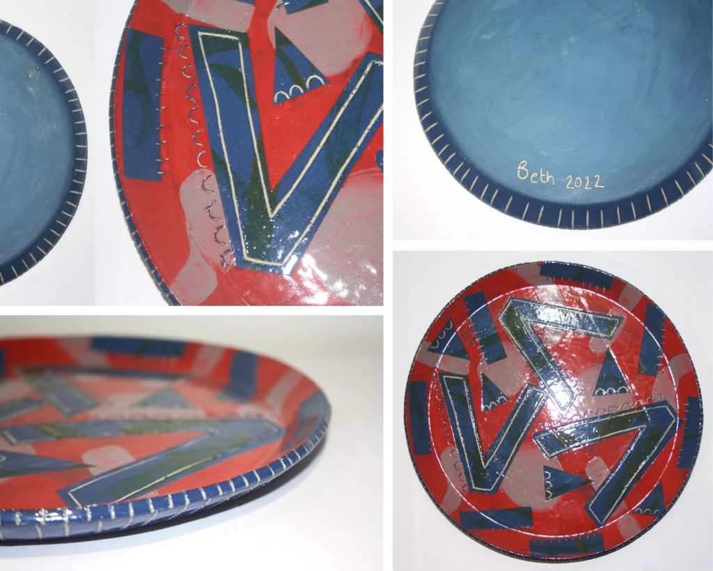
Passion
I decided to use plates as the base for my decoration to give me a good amount of surface area to play with.
For this piece, I wanted to use really rich, dark colours. The cobalt blue and splashes of deep green under the red contrast beautifully. I used sgraffito to highlight elements of the design and enjoyed continuing the decoration onto the back of the plate.
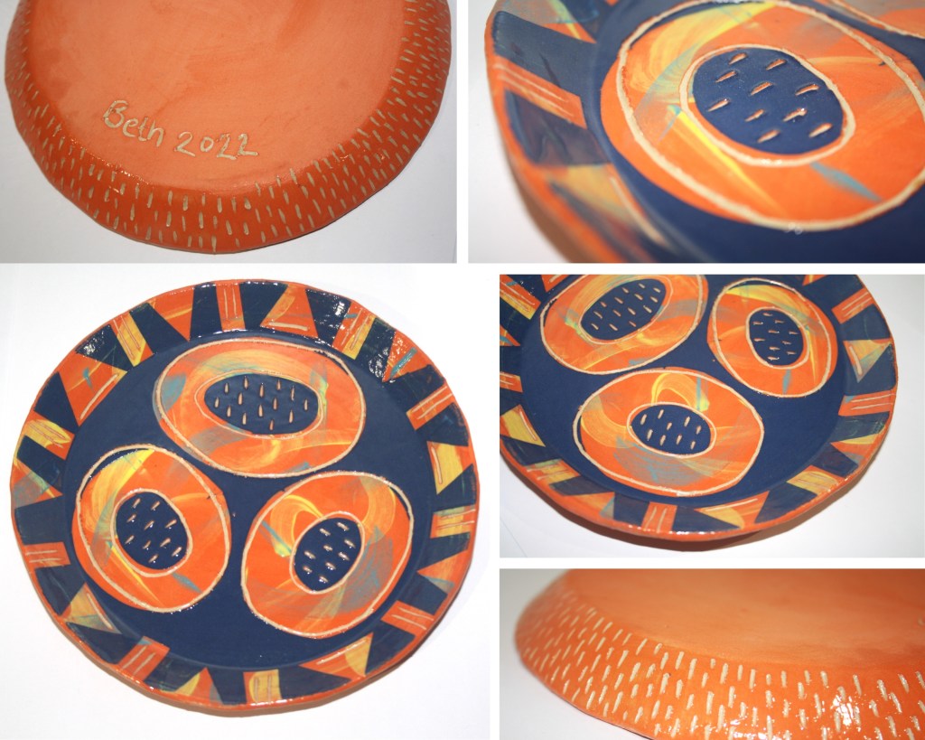
Joy
With this plate, I loved playing with the brighter, contrasting colours. The bold orange peeking through the dark blue bring s a 3D quality to the plate.
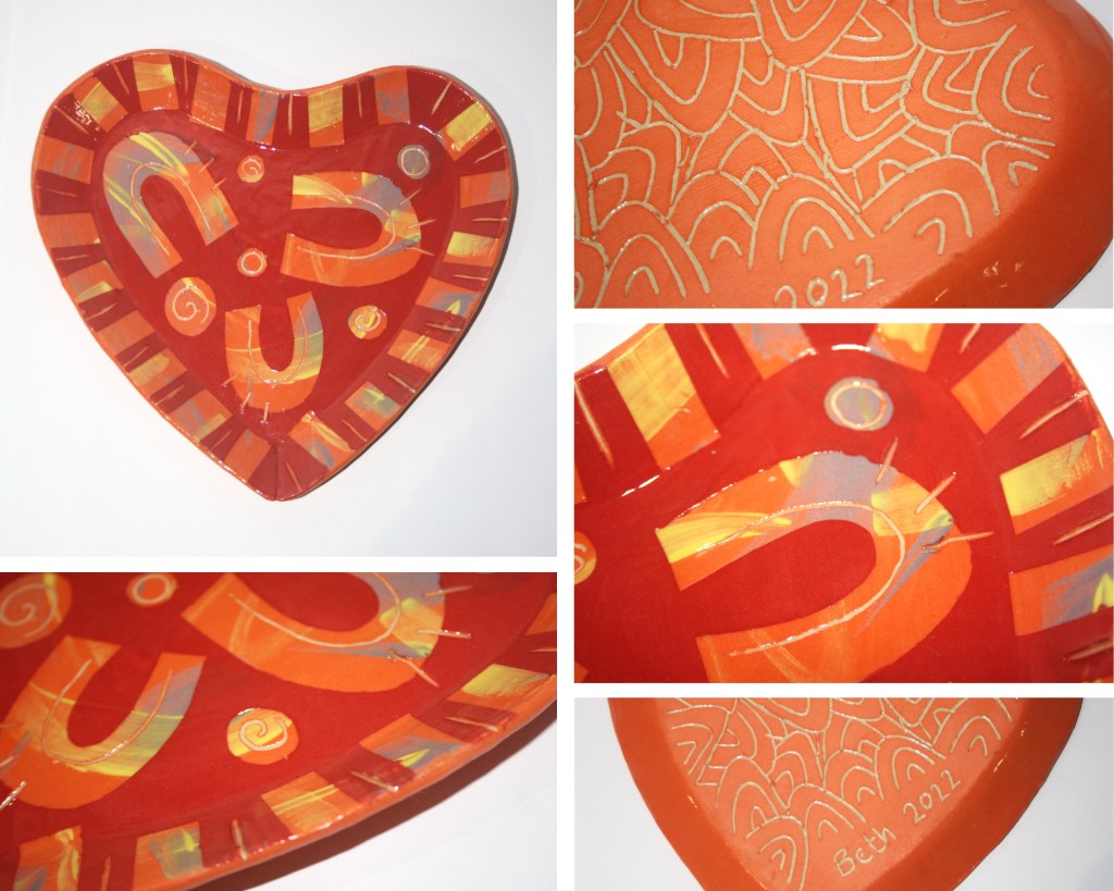
Love
I enjoyed experimenting with a heart-shaped mould for this project, using horseshoe shapes as a nod to love, marriage and romance. I do like the colour combination on this piece, however, I prefer the more contrasting colour combinations on the previous plates.
In the future, I would try to use a deep purple or bright pink to contrast with the red and orange tones.
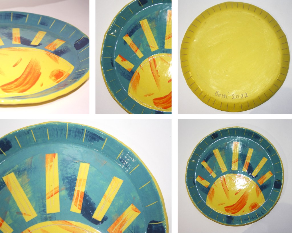
Ray of Sunshine
This plate is much less abstract than my other pieces and I really enjoyed using the beautiful bright yellow and blue to make such a colourful and lively piece.
Ordinarily, I tend to stray from more classical, recognisable designs but I am really pleased with the outcome of this design, even if it is simplistic.
I really look forward to continuing to explore the boundaries of slip design and how I can use this layering technique and sgraffito to create interesting decoration for my work.

Leave a comment